Yak
2021
Devloping a kayak rental mobile app that's
fast & easy
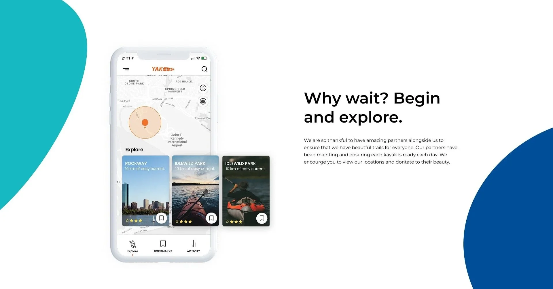
I designed Yak, a mobile app that makes finding and renting a kayak simple. Working with UW App Factory, I focused on helping users discover nearby rental locations, check availability, and complete their rental with fewer steps—making it easier to get out on the water, even on a spontaneous trip.

Role
UX/UI Designer
Timeline
2 Months
Team
UW App Factory
Platform
Figma, Jira
The Problem
Many people want to explore their local waterways—lakes, rivers, coastal areas—but face friction when trying to rent and use kayaks.
Current kayak rental systems and apps often suffer from: These pain points discourage potential users from adopting kayaking as a regular activity, limit spontaneous usage, and reduce both the user satisfaction and market growth for kayak rental services.
Poor discoverability of kayak rental locations and available equipment. Users may not know which spots offer rentals, or whether kayaks are available at a given time.
Low emotional engagement—the experience doesn’t feel inspiring or tied to local adventure; it often resembles generic rental apps or travel/activity apps without personality or incentive.
Cumbersome reservation or rental flows, requiring too many steps, confusing UI, or physical barriers (e.g. needing to visit a location in person just to unlock a kayak).
Limited tracking & reward systems so users don’t get motivating feedback or a sense of progress when kayaking or exploring.
Solution Highlights
Design a mobile app, YAK, that makes kayaking more accessible, engaging, and seamless by:
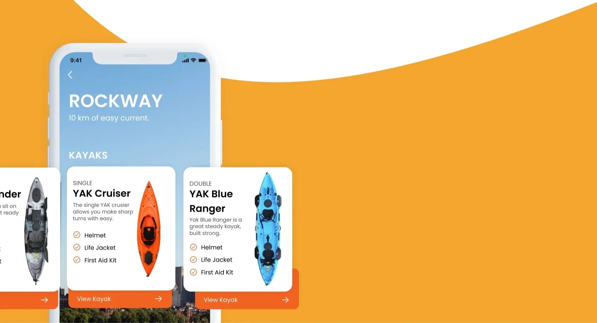
Allowing users to search and discover kayak rental locations nearby, reading real-time availability and seeing pricing/options.
Enabling fast, intuitive rentals (for example via NFC unlock, minimal taps) so users can get out on the water without delays.
Incorporating features like activity tracking, location bookmarking, and a reward/points system to encourage usage and build emotional connection.
Providing a clean, modern, inviting UI that appeals to both seasoned paddlers and first-time users.
The process
The core of the product
Before doing any ideation I started to analyzing the existing conventions of rental services, travel, and activity apps to understand the core of the product. Analyzing comments in the app store also helped me to know the pain points and strength of the current app conventions.
Key Findings
Features Discoverability issues
They don’t feel the emotionally bounded to app.
Too many taps for the simple action
Research analysis and key insights
I grounded my redesigns in user behavior and feedback to drive high-impact improvements.
Feature Discoverability Issues
Users struggled to find and understand key features, reducing adoption and engagement.
Lack of Emotional Connection
Friction in Getting Started
The experience felt transactional — users didn’t feel personally connected or motivated to return.
Long sign-ups and setup steps made renting feel like a chore. Users wanted to get on the water quickly and easily.
Understanding the “Why” with user research…
User Persona
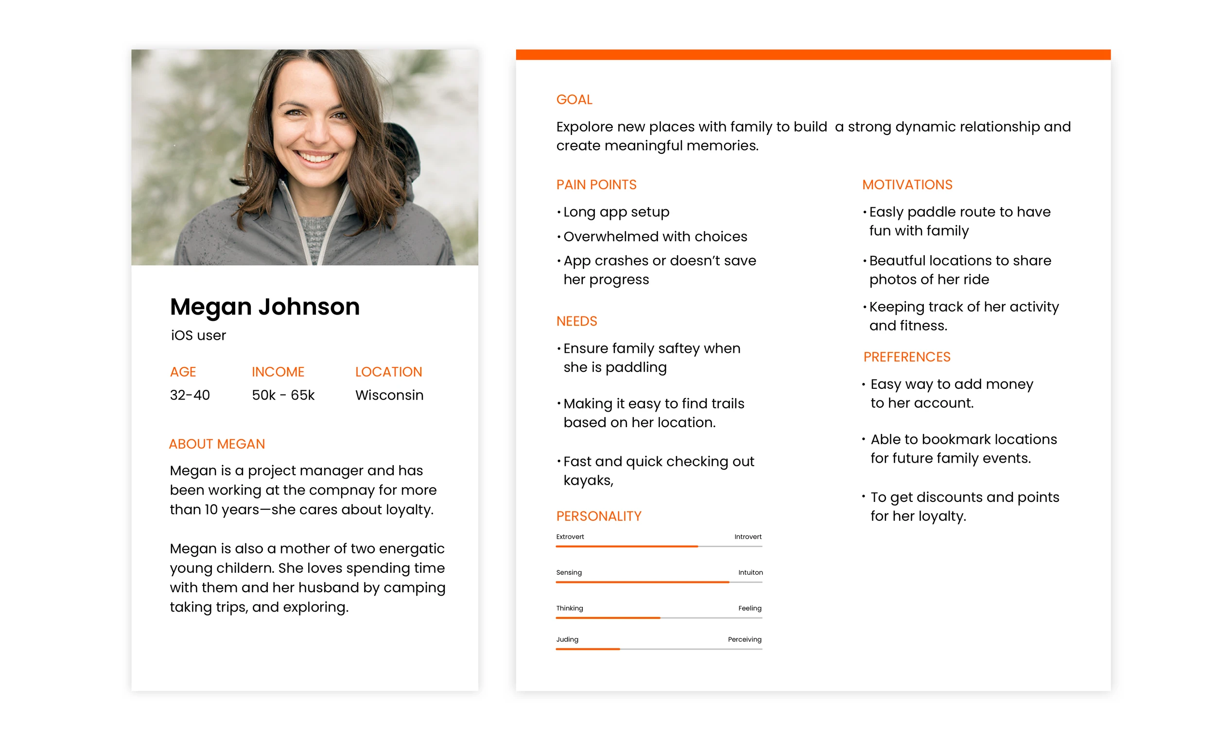
To identify pain points, needs, and goals, I created a persona based on found patterns in users actions and tasks.
After surfacing key pain points, I mapped overlapping behaviors and motivations into a focused persona. This helped the team quickly align on who we were solving for, streamline prioritization, and gut-check features against real user needs throughout the project.
IA & Wireframes
Building Structure
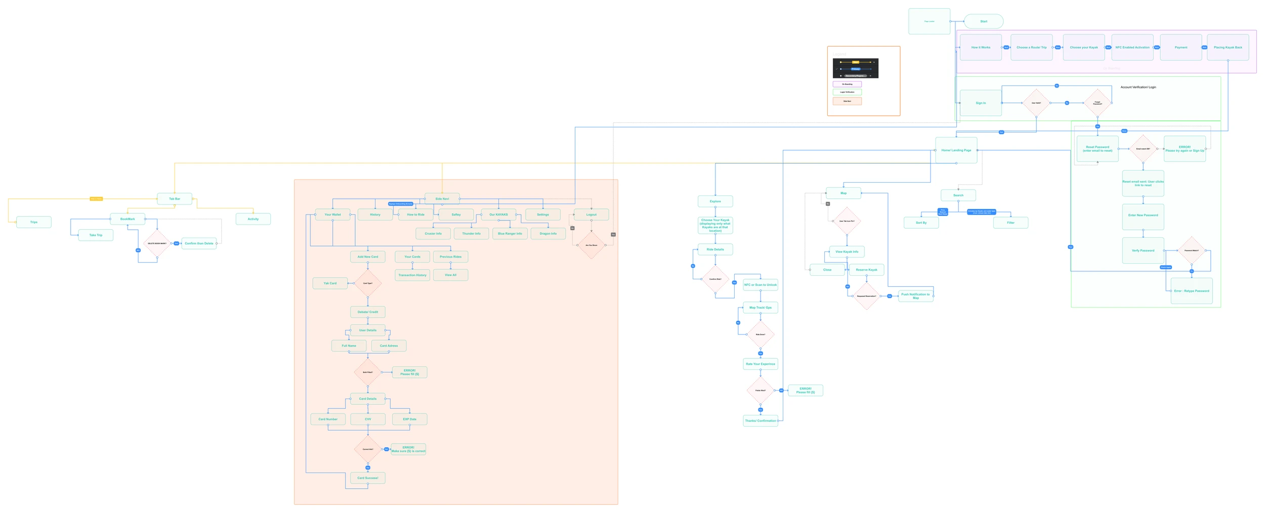
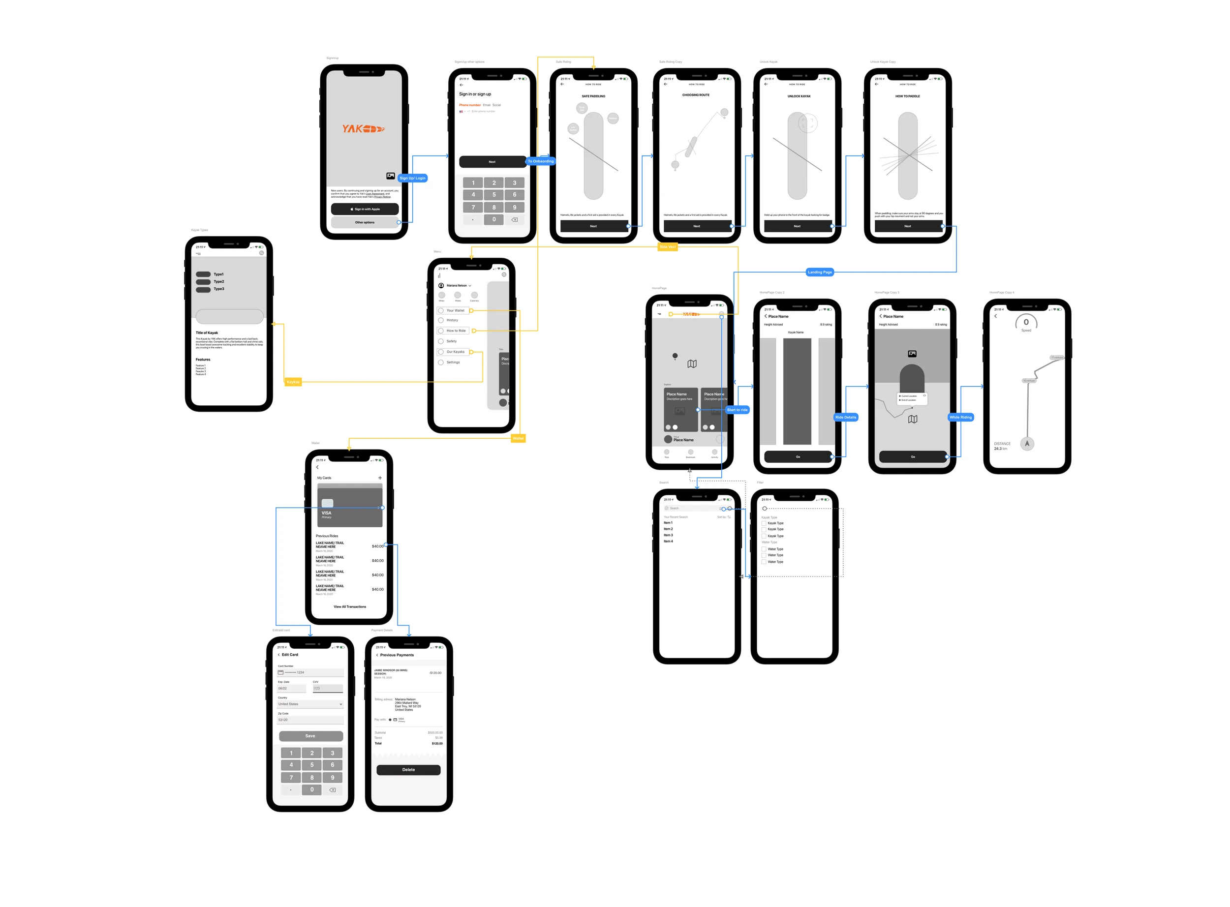
After doing my research, I built a user flow to confirm my assumptions. There were many iteration, and I landed on this flow.
The Design
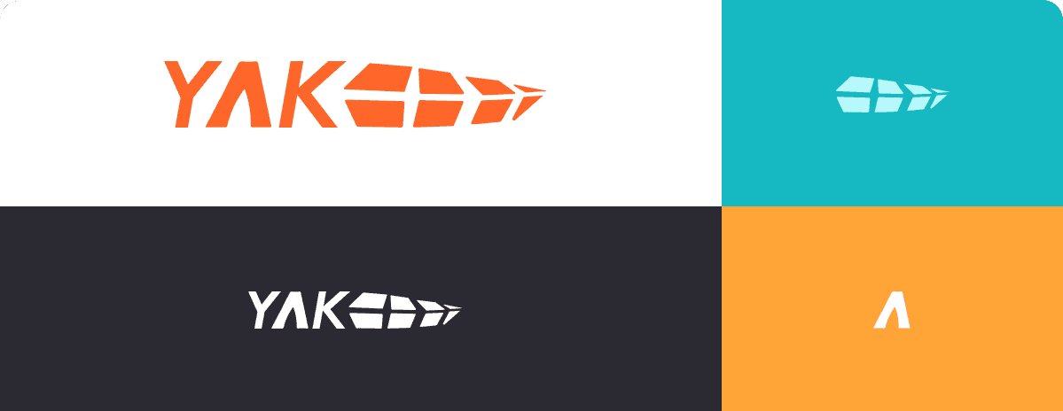
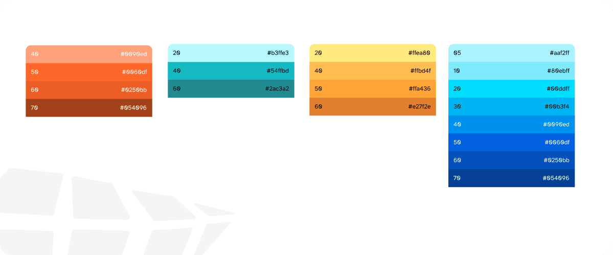
Laying the foundation. Crafting a Holistic Look and Feel. This is a style guide for YAK's brand and mobile application. This style guide contains colors, typography, components, buttons, icons, and
On Boarding
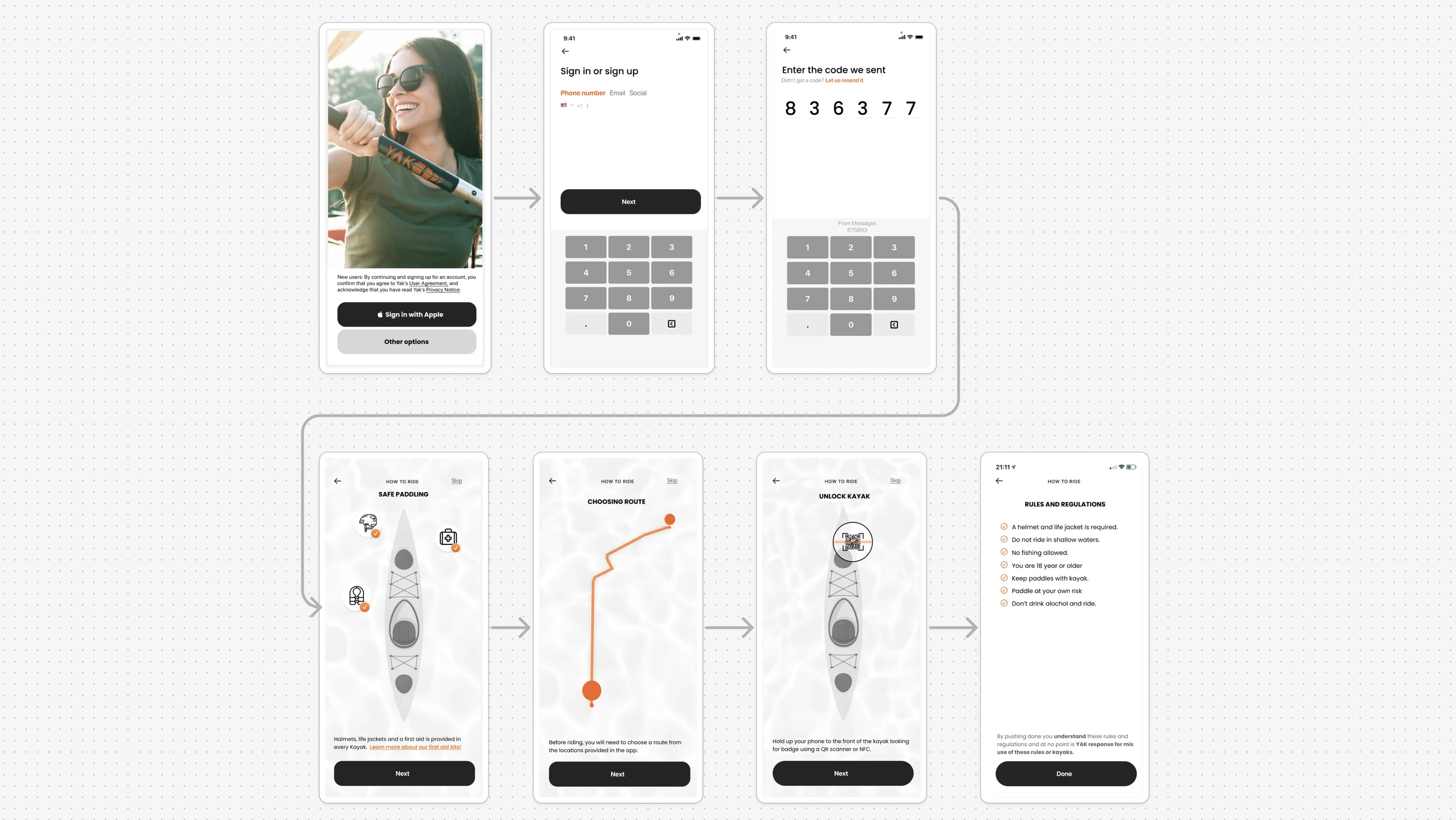
After doing my research, I built a user flow to confirm my assumptions. There were many iteration, and I landed on this flow.
The Core of the Product
Paddle Smart
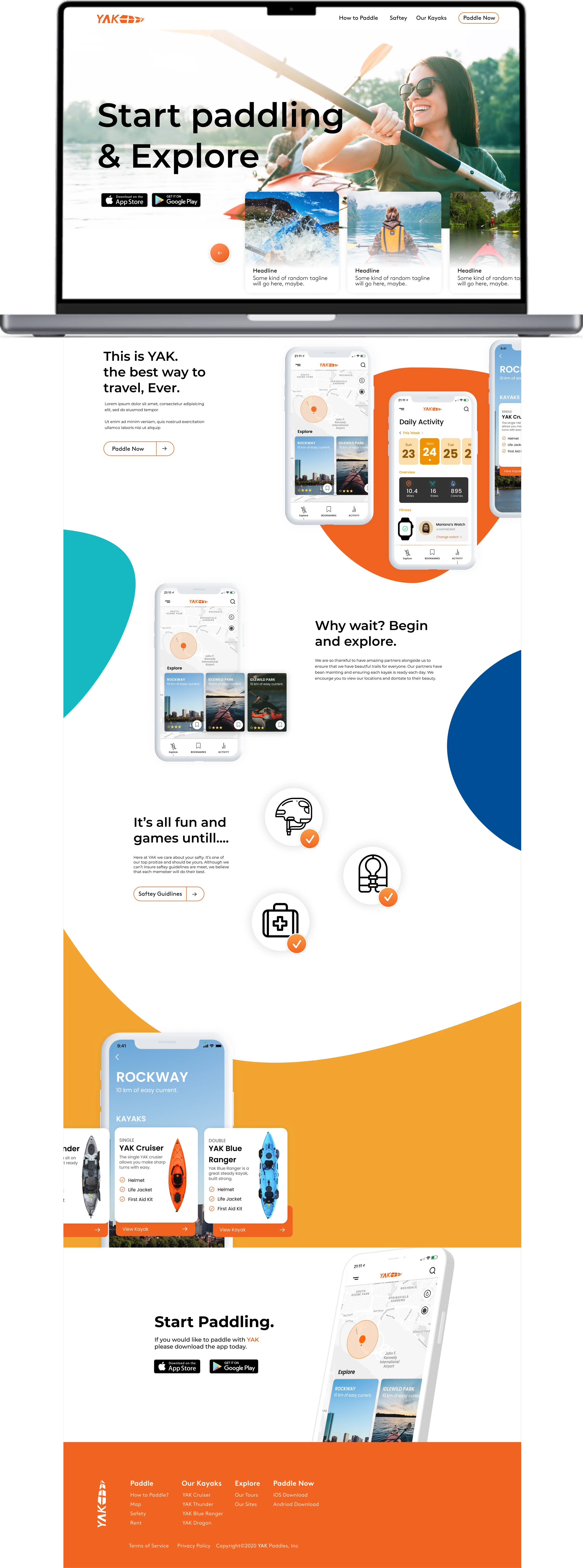
Introducing YAK, an elegantly designed kayaking app that transforms the way you explore the waterways. The user interface is intuitive and user-friendly, making it simple for users to rent kayaks with a tap, thanks to NFC technology. The app's aesthetic blends functionality with a fresh, modern look, inviting users to navigate local waterways effortlessly.
How to start paddling
3…2…1 GO!
After doing my research, I built a user flow to confirm my assumptions. There were many iteration, and I landed on this flow.
Through research and usability tests, a few patterns stood out that now guide how Eclipse is designed and built.
This project challenged me because I’d never shipped an AI workflow before, and Eclipse had almost no comparable products—both forced me to learn fast and invent carefully.
Learnings
Designing AI users can trust
Inventing patterns for a one-of-a-kind tool
My biggest stretch was shaping AI interactions for older, less-technical users. I studied established patterns, tested plain-language prompts, and made every suggestion reviewable and reversible with visible confidence.
With few benchmarks, I modeled the domain from the ground up—page as the atomic unit, relationships for evidence, and guided flows with optional flexibility. Rapid paper→prototype→test loops helped translate hangar workflows into UI without copying the wrong conventions.